
Color was added for realism, warmth and attention
Before viable color film, some photographers and publishers added color to monochrome pictures by hand. Ink or colored pencil could warm a face, suggest lifelike detail or introduce a playful note. It could also pull attention toward a garment, medal or part of the setting. This was an occasional creative choice, not a standard feature of every old photograph.
Sometimes the effect was barely there: pink cheeks, perhaps, or a blue ribbon. Elsewhere, the carpet, curtain and painted backdrop became the loudest parts of the picture. The Library of Congress collection includes restrained examples as well as some surprisingly exuberant studio color.
That distinction is useful if you want to explore AI Time Portraits too. Older visual styles have their own logic. A sepia wash may suggest age, but it will not create a convincing alternate era by itself.
A practical visual key
Labels vary between collections and specialist settings. Think of this as a practical viewing aid, not a strict conservation glossary. The revealing question is how the color relates to the photograph underneath.
-
Restrained tinting: transparent accents leave the monochrome shadows, highlights and textures easy to read.
-
Heavier overpainting: broad or dense color takes over more of the picture and may hide parts of the photographic base. "Overpainting" is used here as a visual description, not a formal museum classification.
-
Color photography: palette alone will not identify it. Check the collection record to learn whether the color was applied by hand or came from a photographic color process.
Notice what the maker left alone. If the cheeks, jewelry and flowers have color while nearby areas stay neutral, the eye naturally goes to those selected details.
Start with one recognizable face
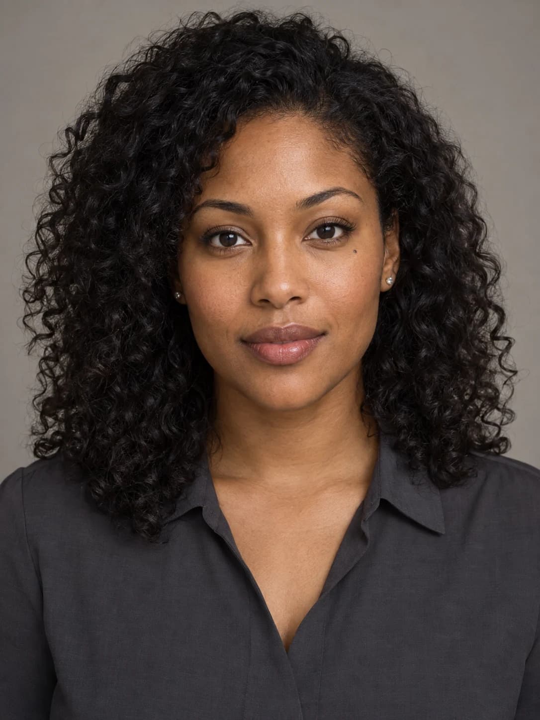
A fair comparison starts with one neutral portrait and a consistent identity. The face, skin tone and distinguishing features need to remain recognizable, even as the hair, clothes, pose, setting, light and color treatment change.
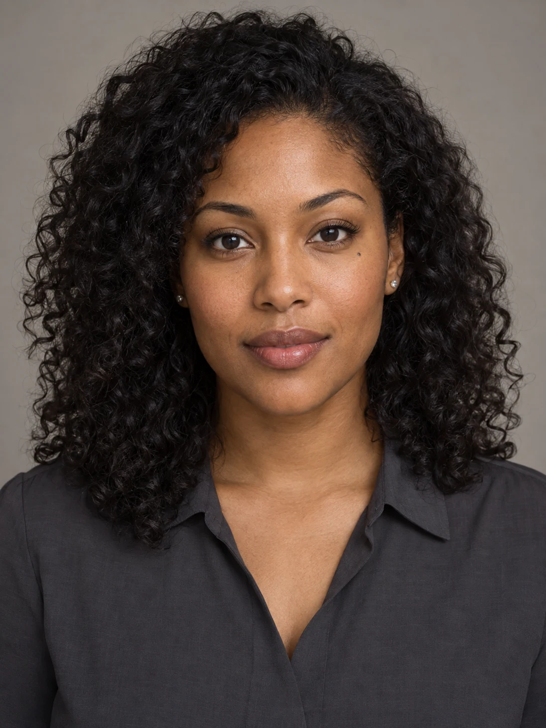
A neutral portrait anchors the comparison so changes in color, styling and setting are easier to notice.
This source portrait is deliberately plain. There is little to distract from the face, so it is easier to judge whether each version creates another lifetime for the same person or simply swaps one palette for another.
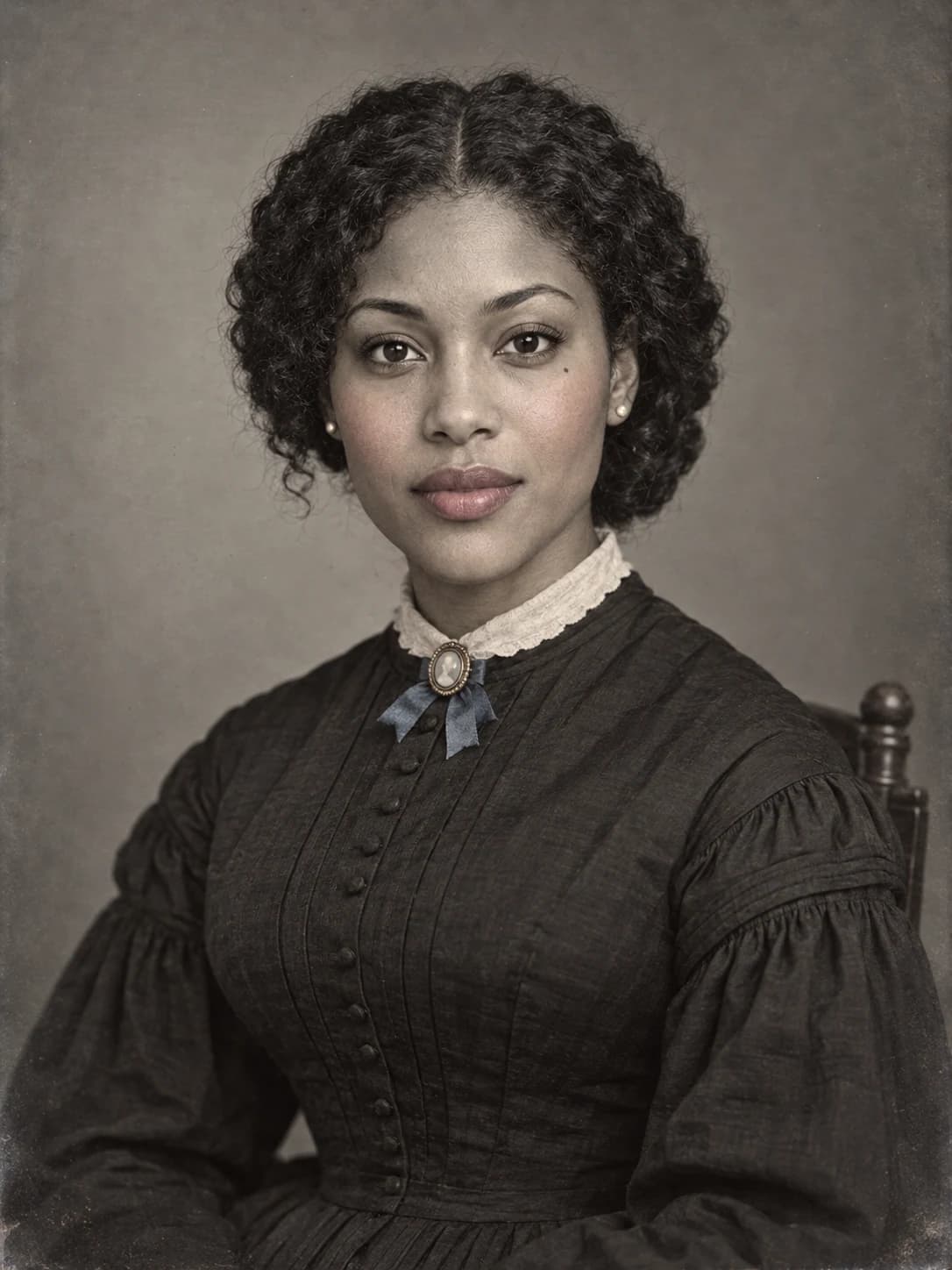
First interpretation: restrained Victorian tinting
The first interpretation barely nudges the color. Monochrome tone still shapes most of the face, dress and background. Small accents on the cheeks, lips, brooch and ribbon stand out because they are used with restraint.
The formal expression does plenty of work too. It should not be read as proof that people in the past were joyless; the history of why people rarely smiled in old photographs gives that familiar look more useful context.
Second interpretation: the studio becomes part of the color
The second version lets color travel into the room. Rose, sage and gold appear across the dress and painted backdrop, making the studio itself part of the portrait. This is a creative interpretation, not a formula for every early twentieth-century photograph.
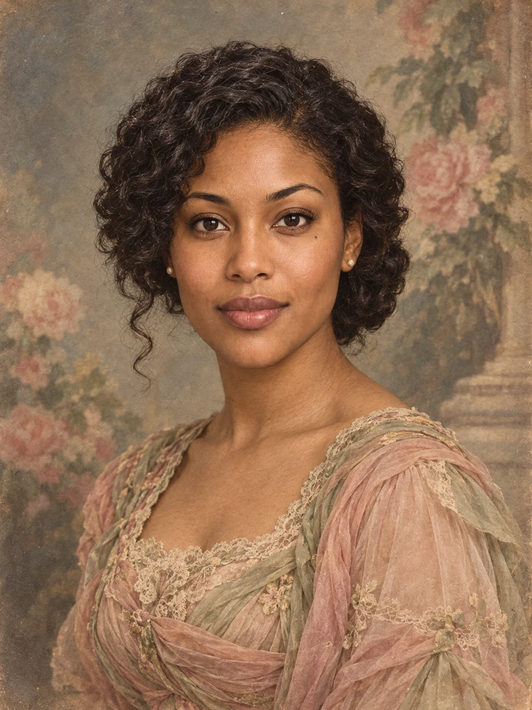
A wider palette lets the backdrop and clothing participate in the portrait without erasing its tonal foundation.
Backdrop, hairstyle and lighting matter every bit as much as pigment here. Changing the color alone would not be enough. For another studio fantasy built around polished styling and sculpted light, you can plan an Old Hollywood glamour portrait.
Third interpretation: color as decoration
By the third version, color is part of the spectacle. Coral, turquoise and yellow spread across broad areas. The curtain and painted garden jostle with the sitter for attention, and the slightly uneven edges make the painted surface visible. Compared with the first portrait, it is unapologetically theatrical.
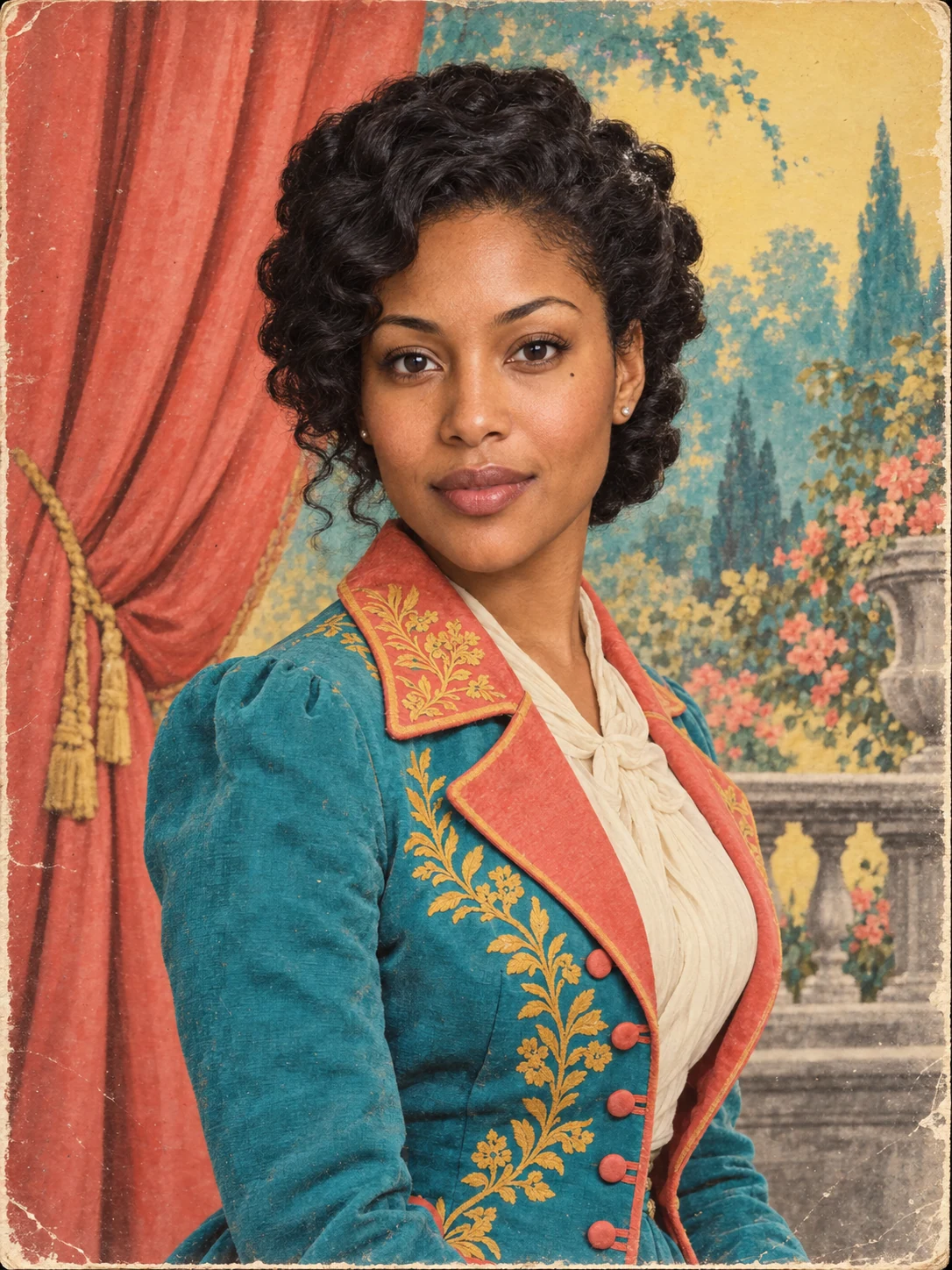
Broader color fields turn the portrait into a decorative object while the same face remains recognizable.
These portraits are not a complete historical timeline. They are a controlled visual exercise: keep the person recognizable, then see how the placement and strength of the color change the picture's emotional center.
Hand-coloring extended beyond framed portraits
Hand-applied color was not confined to framed portraits. The Library of Congress says it appears frequently on early twentieth-century glass lantern slides used in educational lectures. The collection also includes colored stereographs and studio portraits, objects made for different settings and purposes.
The work happened by hand, one choice at a time. A collection photograph shows Department of Agriculture employee Elsie Sellers coloring posters and what appears to be a lantern slide. Each accent began with a practical decision: where should the viewer look?
How to build a convincing hand-colored portrait idea
-
Pick the mood before the palette. A little color on the cheeks and lips can feel intimate; a vivid backdrop pushes the portrait toward theater.
-
Choose what will stay monochrome. One colored detail has more visual weight when much of the image remains neutral.
-
Make the hair, clothes, pose, backdrop and lighting belong to the same world. Color grading cannot carry a period-inspired portrait on its own.
-
Keep the face familiar from one era to the next. Preserve its proportions, skin tone and distinguishing features while changing the imagined life around it.
-
For a collection image, read the catalog description before deciding that its visible color was applied by hand.
Try another lifetime without losing the person
Keep the person familiar, then rebuild the world around them. Choose an era and decide whether the color should whisper or take command of the frame. Give the setting real attention too. When you want to try the idea with your own portrait, explore AI Time Portraits.
The images are editorial AI inspiration featuring a fictional person, not archival photography or actual Throwback output.